Text results reward the page that answers first. Image results reward something else: the picture that shows the deliverable before a word is read. The two doors lead to different behaviour, and a high text position can be worth very different amounts depending on which door the searcher walks through.
This lesson follows the image door all the way in — image preview, source page, download, payment — then applies the same clarity to another entry point, WeChat Search. The thread: identify the visual task, receive the image click properly, and verify use with real numbers.
One caution before the door metaphor runs away with itself: image search is not a separate kind of SEO. The page is the same page — same title, same content, same signals. What differs is the image entry: the searcher arrives through a picture, with a visual expectation formed in seconds, and judges the image landing page against that picture before reading a word. Optimise the image entry and the landing together, or the door opens onto a room the visitor didn’t ask for.
Visual intent changes where attention goes
Two queries, two kinds of attention. Someone searching “letter cover” may examine template images first, scrolling a wall of designs before reading anything. Someone searching “20 minute timer” may use the timer directly on the image result page and never click anywhere. Same search box, opposite behaviour. A high text position in the first case sits below the images; in the second, the task completes without a visit at all. Position is not image clicks. Volume is not visits, and visits are not people. Each step needs its own image measurement, and this lesson keeps them apart throughout.
Inspect the actual result page for the target region and device before producing anything. Four questions, answered from what you see: Are images prominent, or does text dominate? Does the searcher want inspiration, a printable image file, or an editable tool? Are the results image sites, guides, or tools? And if the task already has an immediate answer on the page, what additional value would your page offer — multiple templates, high-resolution originals, editable files, batch processing, a better tool? Images alone don’t establish demand for a paid image pack. A wall of pretty image previews with no file behind them is decoration, and decoration doesn’t convert.
Check both phone and desktop, because the same query shows different doors on each. Image modules run larger on phones, where a thumb scrolls a wall of pictures and text results shrink below the fold. On desktop the text result may still lead. Check the device in the visitor’s hand, not the device on your desk. Region matters the same way: the same phrase can surface image-heavy results in one market and tool-heavy image results in another, and the assets you build should follow the market you serve.
Make the additional-value question concrete before spending anything. For the timer query, the image result page already runs the timer — your value might be five preset timers, shareable links, and a fullscreen mode for classrooms. For the letter-cover query, the images already show designs — your value might be editable templates in the right sizes, with fonts included and print settings ready. If you can’t name the extra value in one sentence, you don’t have a page yet. You have a hope, and hopes don’t rank.
Three intents cover most image queries. Viewing: the searcher compares designs and collects ideas — the image preview itself does much of the work, and the click must offer more of the same, better organised. Finding: the searcher wants a specific image file — a poster, a template, a wallpaper — and the landing page must hand it over with the fewest obstacles. Using: the searcher wants the tool behind the image — an editor, a generator, a converter — and the image is an advertisement for the task. Name the intent before choosing assets. A viewing page built like an image download page frustrates browsers; a download page built like a gallery frustrates people in a hurry.
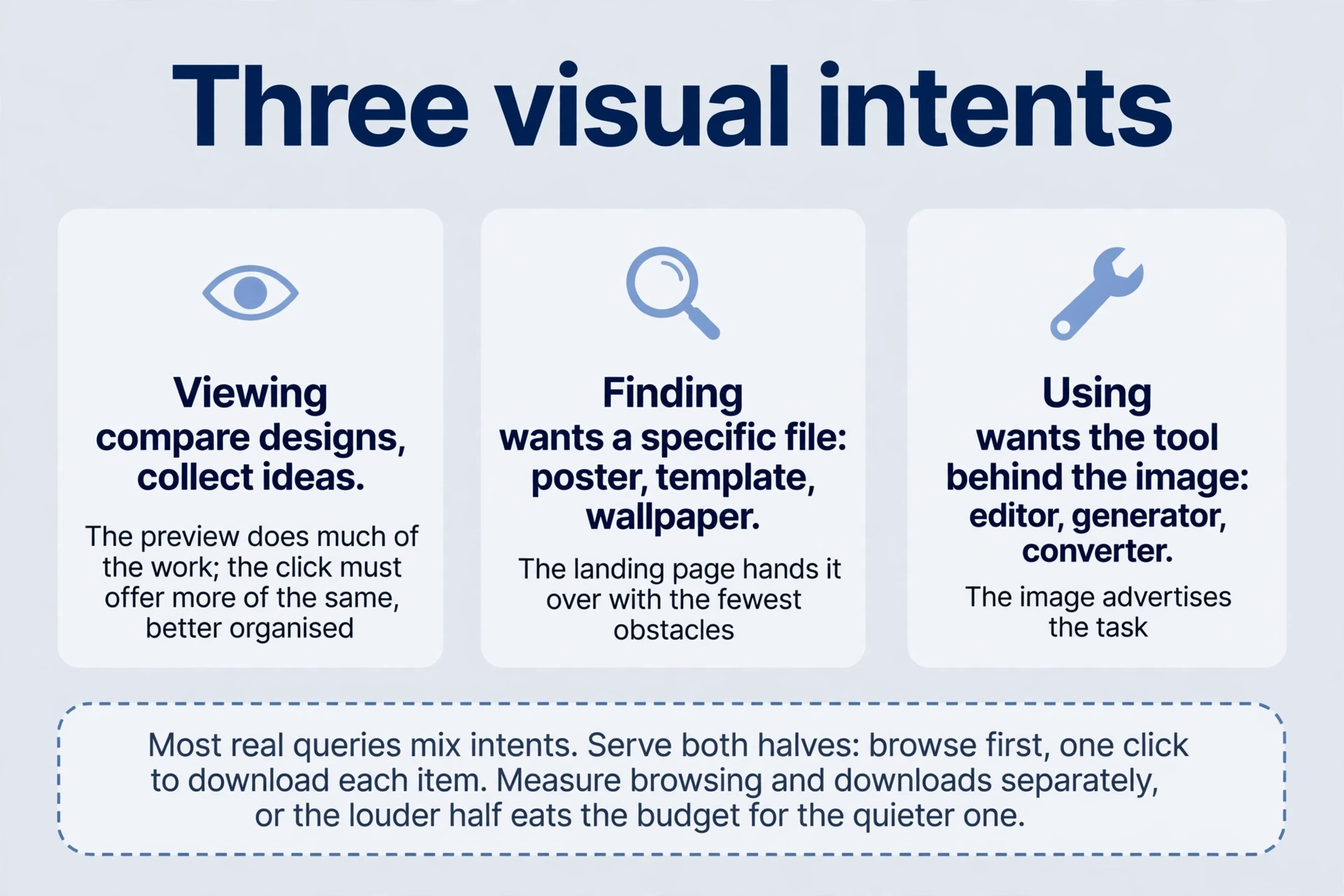

Most real queries mix intents. “Poster” brings browsers collecting ideas and buyers hunting an image file in the same list. One page can serve both if it leads with the gallery and ends each item with the image file: browse first, download one click away. Watch which half converts. If gallery scrolling dominates and downloads stay flat, the image files disappoint. If downloads dominate and browsing is thin, the collection is too narrow. Mixed intent needs both halves, measured separately, or the louder half eats the budget for the quieter one.
Complete the journey after the image click
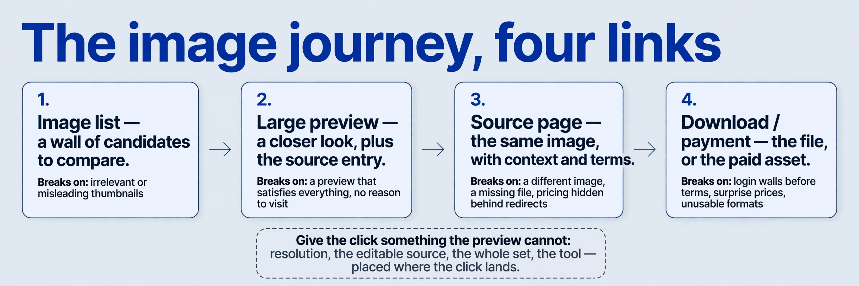
The chain has four links: query → image list → large preview → source page. An image preview may satisfy part of the need — the searcher sees the design, judges the style — and the visit to the source happens for an image download, more detail, or further work. Image visibility, previewing, site clicks, image downloads, and payment are separate outcomes. An attractive screenshot validates none of the links after itself. Each link can break independently, and the breakage shows up in different numbers.
One break deserves attention because it looks like success: the image preview that satisfies everything. A wallpaper searcher sees the full image in the preview and never clicks — the image preview is the product. The click then needs something the image preview can’t give: the full-resolution file, the editable source, the whole set. If the landing page offers only the same image at the same size, the chain ends at the preview and the visit count stays flat while impressions climb. Give the click something the preview can’t. Resolution, editability, the set, the tool — pick the one your visitor actually wants and put it where the click lands.
The image preview also carries a label: the source entry beside the image. A recognisable source name earns clicks that an anonymous address doesn’t, and a page title that matches the image keeps the promise the preview made. The image source entry is the click’s label. Keep the site name consistent, keep page titles aligned with the images they host, and the preview reads as an invitation from a known place rather than a picture floating without an owner.
| Stage | What the searcher gets | What breaks the chain |
|---|---|---|
| Image list | A wall of candidates to compare | Irrelevant or misleading thumbnails; no visible difference from neighbours |
| Large image preview | A closer look, plus the image source entry | A preview that satisfies everything, with no reason to visit |
| Source page | The same image, with context and terms | A different image, a missing file, pricing hidden behind redirects |
| Download / payment | The file, or the paid asset | Login walls before terms, surprise prices, unusable formats |
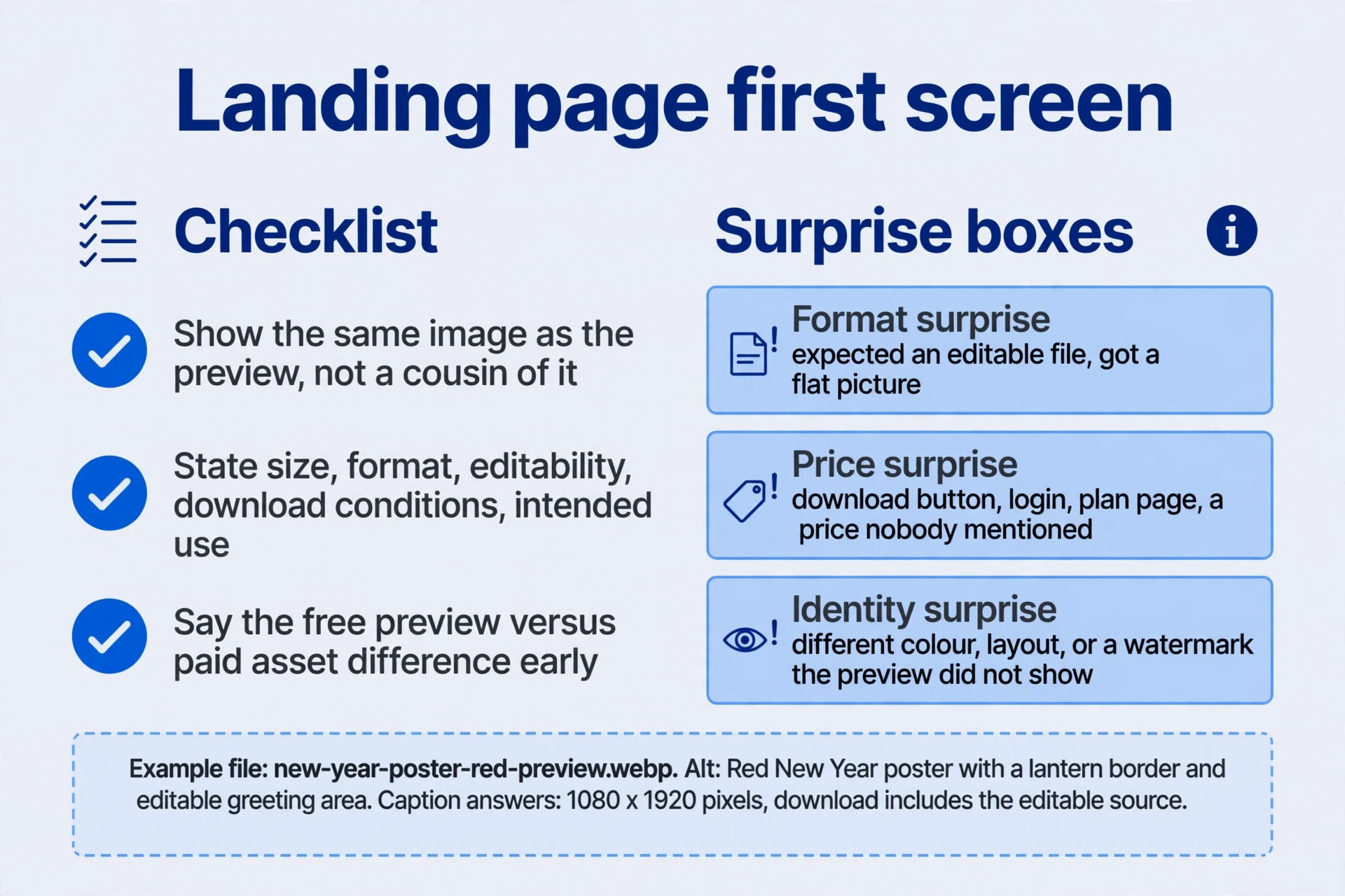
Suppose you offer New Year posters. The landing page should immediately show the same poster — the one from the image preview, not a cousin of it — and explain dimensions, format, editability, image download conditions, and intended use in the first screen. State the difference between free image previews and paid assets early, before the visitor invests clicks. Losing the image on arrival, or hiding pricing behind several redirects, causes abandonment that no amount of image traffic repairs. People clicked a picture. Show them the picture, then the terms, then the image file. Study competitors’ business flows for what works, without copying every source of friction they happen to have. Their friction is not their strategy.
Audit the landing page for the three classic surprises. Format surprise: the visitor expects an editable image file and receives a flat picture. Price surprise: the image download button leads to a login, the login leads to a plan page, and the plan page names a price nobody mentioned. Identity surprise: the poster on the page differs from the image preview — a different colour, a different layout, a watermark the image preview didn’t show. Each surprise costs the same thing: the visitor’s willingness to try the next image click. Name the terms before the image click, and the visitors who arrive are the ones who already accepted them.
Make the image and its context understandable
Use Google’s image SEO guidance as a reference, then test one image and its landing page together. Record the image URL, visible caption, alt text, and the action available after opening the page. Check page tags and canonical URLs before comparing image-search results. For thumbnails and other result features, the structured data and search appearances guide distinguishes automatic image selection from supported markup.
Image optimisation starts with content, not attributes. Choose clear images relevant to the task, explain what they show and how to use them, and place them near the corresponding discussion. A poster belongs beside the paragraph about posters, not in a gallery at the bottom of an unrelated page. Use suitable filenames and alt text — the filename names the image file for humans and systems alike, and the alt text explains the image where it appears. A descriptive filename reads like the code example below: what it is, which variant, what kind of image file. A bad one reads like “image1” or a string of keywords. Alt text follows the same rule from the earlier tags lesson: describe the image’s contribution in context — what it shows and how to use it — not a keyword list. Avoid turning an entire guide into one unexplained image. A screenshot of instructions is not instructions. Text that people can read, copy, and search beats text baked into pixels every time.
The technical side is plumbing, and it has to work before anything else matters. Expose images through readable image-source attributes and keep both images and host pages accessible to crawlers. Distinguish thumbnails, originals, and download links — three different files with three different jobs, not one file doing all three badly. If lazy loading is in use, verify discovery without requiring a person to scroll; an image the crawler never reaches can’t appear anywhere. Balance resolution with file size so mobile loading stays usable. A 5 MB original that loads beautifully on office wifi and stalls on a phone is a failed image for half the audience. The search engine’s image guidance emphasises context, discoverability, and alt text — and no single attribute guarantees top-module placement. The whole context earns the place, or nothing does.
<figure>
  <img src="new-year-poster-red-preview.webp"
       alt="Red New Year poster with a lantern border and editable greeting area">
  <figcaption>Preview: 1080 × 1920 pixels. The download includes the editable source.</figcaption>
</figure>
The caption does quiet work here: image dimensions, and the fact that the image download includes the editable source. Both answer questions the visitor asks before downloading. Write captions that answer, not captions that label.
Images drift. Files get replaced, image previews update, landing pages change, and an image preview that once matched its download slowly stops matching. Check the pair periodically: open the landing page from the image result, compare the preview with the file on offer, and confirm the terms still say what the page does. A quarterly pass over the top image pages catches drift before visitors do. Previews and files must stay the same promise, months after launch, not only on launch day.
AI generation can assist with patterns and variants — more poster styles, more colour options, faster drafts. Review text accuracy, distortions, and consistency between image previews and downloadable files. Generated text in images garbles easily; a poster with a misspelled greeting is worse than no poster. An image preview that differs from the image download breaks the chain at the last link, where trust is thinnest. The text-generation capability noted in the 2023 material is a dated observation, not a permanent comparison of tools — capabilities move, and last year’s ranking is this year’s trivia. AI generation also doesn’t settle image licensing or permitted use. A generated image can still resemble a protected work, and “AI-made” is not unlimited permission. The legal questions around training data remain unsettled in several jurisdictions, and a seller’s terms can’t settle them for buyers. What you can do is narrower and entirely in your control: state the actual usage conditions for every asset — what buyers may do, where they may use it, and what remains restricted — and keep a record of each asset’s source and licence. Conditions in plain words beat a badge every time, and records beat memory when a buyer asks what they actually bought. Keep the licence record with the asset, not in a separate document nobody opens.
Turn the image-pack example into a measurable test
One archived journey shows the full chain working commercially. A search on a Chinese image search for New Year posters leads to a preview, then a stock-image site, then asset selection, download, login, and payment plans. Archived prices were RMB159 for a limited annual plan, RMB209 for unlimited annual access, and RMB259 for lifetime access. The author reads the ladder as favouring lifetime purchases. That’s a design hypothesis — the most expensive option positioned as the sensible one — not observed purchasing data. Price ladders suggest. They don’t prove.
The revenue estimate built on the journey shows why every assumption needs its own evidence:
| Archived calculation | Result | What needs image measurement |
|---|---|---|
| 600,000 ÷ (2 × 5) | 60,000 people, assumed | Visits and unique visitors are different measures |
| 60,000 × 40% | 24,000 new users, assumed | Your new-user definition and date range |
| 24,000 × 5% | 1,200 payers, assumed | Observed preview-to-download-to-payment conversion |
| 1,200 × 259 | RMB310,800 | Actual orders, refunds, and ongoing supply costs |
| 1,200 × $29.9 | $35,880, assumed monthly subscriptions | Regional willingness to pay, renewal, churn, and acquisition costs |
Read the table top to bottom and each row leans on the one above. Third-party visits are not people: one person visits repeatedly, bots visit, the same device visits from two networks. Dividing by ten — two visits on each of five days — is not a universal user estimator; it’s a guess dressed as arithmetic. New-user share depends on the definition and the date range. Conversion depends on the observed path from image preview to download to payment, not on a round 5%. Order value depends on actual orders, refunds, and the ongoing cost of supplying fresh assets. Change any one assumption and the headline number moves by tens of thousands.
Run the sensitivity before believing any single figure. Hold the other assumptions fixed and vary conversion alone:
| Conversion | Payers from 24,000 new users | Revenue at RMB259 |
|---|---|---|
| 1% | 240 | RMB62,160 |
| 3% | 720 | RMB186,480 |
| 5% | 1,200 | RMB310,800 |
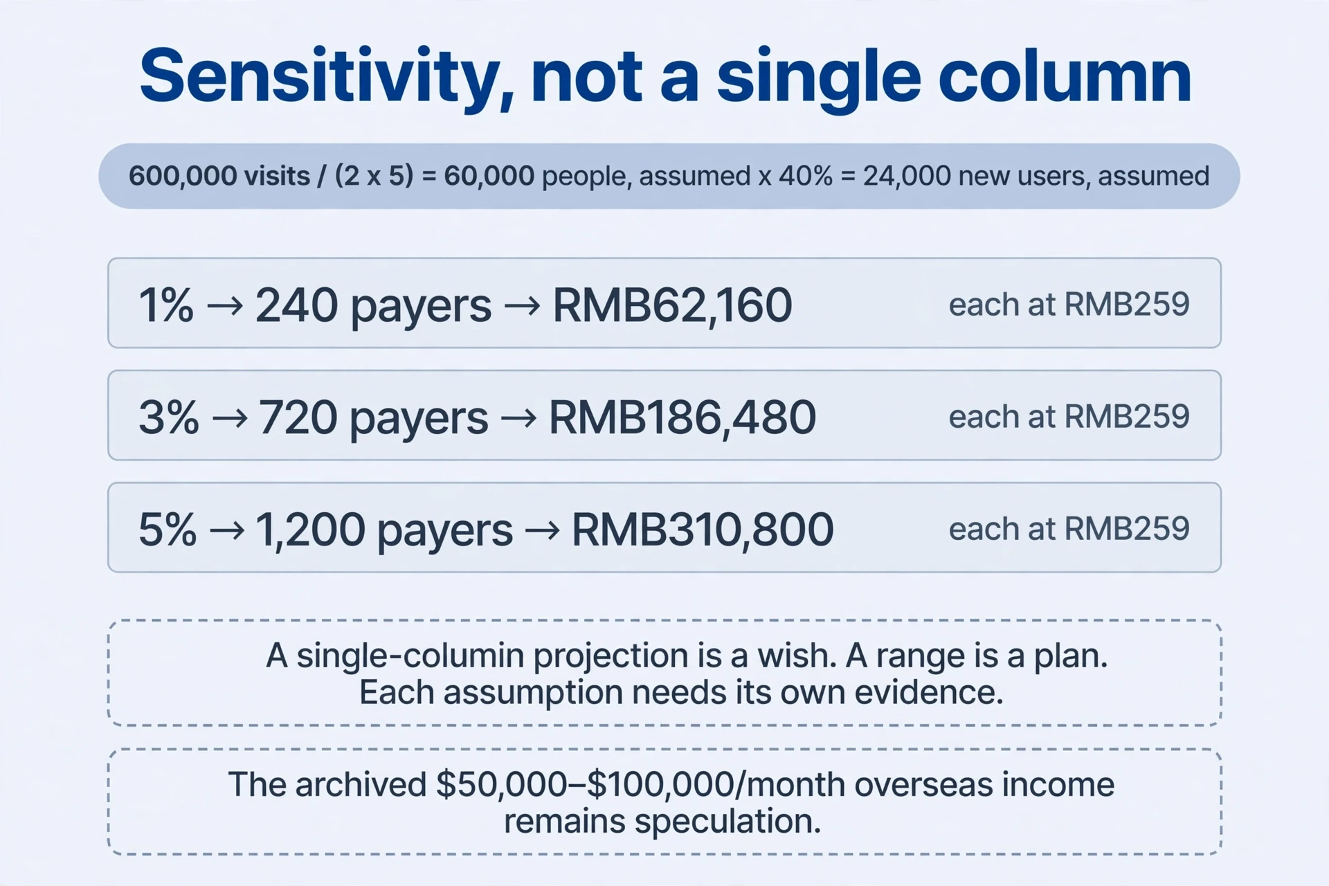
The same image traffic produces a fivefold range from one plausible input. A projection that only shows the 5% column hides its own fragility. Show the range, name the assumption each column rests on, and replace the columns with measurements as they arrive. The archive’s further suggestion of $50,000–$100,000 a month overseas remains speculation. Replacing a domestic lifetime price with dollars doesn’t establish proportional overseas revenue — willingness to pay, renewal, churn, and acquisition costs differ by region, and none of them appear in the calculation. A single-column projection is a wish. A range is a plan.
A better first experiment is small and honest: a useful image set that earns image-search visits, successful downloads, and a real first purchase. Measure the chain link by link — impressions, image preview clicks, landing visits, downloads, orders — and let the observed conversion replace the assumed one. Then compare monetisation models: ads, packs, subscriptions. Each model has its own conversion shape and its own costs, and the comparison needs real numbers from the same image traffic. Test before scaling. A thousand images built on an untested estimate multiply the estimate’s error, not its revenue.
One real order proves three things: payment works, the price is acceptable to someone, and the image file reaches the buyer. It proves nothing about scale. The second image experiment asks the harder questions: does the buyer return, does the subscription renew, does the next cohort convert at the same rate? Revenue claims graduate from speculation to evidence one order, one renewal, one cohort at a time. One order is a beginning, not a business.
Apply the same clarity to WeChat Search
WeChat Search starts from the same human need as image search: find an answer efficiently, inside an app rather than a browser. Its 2023 creator guidance rewards the same clarity, applied to titles and article bodies. The principles transfer because the reader is the same — someone scanning for the right image entry, deciding in seconds, and punishing mismatches by leaving.
A title works as a signpost: state the subject, the audience, and the necessary conditions. “October family screenings and booking at Example Cinema” tells a parent with children exactly what the article covers and when. A bare venue name tells them nothing. “Important notice” tells them less. Date-sensitive information needs an explicit cutoff, not concealed facts — “book by October 20” in the title beats a date buried in paragraph six. The title is a promise about the content. Keep it.
Four title problems break the promise:
| Problem | What it looks like | Fix |
|---|---|---|
| Exaggerated suspense | A tease with no clear subject | Name the subject and the condition |
| Excessive symbols, repeated keywords | Punctuation and repetition doing the work of meaning | One clean statement of the topic |
| Mismatch with content | A game title leading to unrelated game content | Title only what the body delivers |
| Impersonated official or login image entries | Borrowed authority to earn the image click | Your own name, your own offer |
The image mismatch example is worth pausing on: an article titled for one game that delivers content about another. The image click arrives under false pretences and leaves immediately, and the account’s credibility pays for the visit. Every misleading title spends trust the next honest title needs. Remove unnecessary meeting names and repetition from long titles. A title that carries an organisation name, an event name, a date, and a venue reads as a filing label, not a signpost — keep the subject and the conditions, drop the rest. Completeness need not mean unreadability: a title can carry subject, audience, and conditions in one line without becoming a paragraph. Front-load the subject. Small screens truncate the tail, and the tail is where the conditions usually hide.
The body follows one rule: most-needed information first, then image context and supporting evidence. A reader who came for booking conditions should meet booking conditions in the opening lines, not after three paragraphs of background. Open with the answer, then the conditions, then the background — the order a busy reader scans in, not the order a writer drafts in. Explain causes, conditions, and operations as they matter, using image examples or media when they help understanding. Media-led image articles still need explanatory text — a video or image gallery without words leaves the searcher nothing to confirm and nothing to quote. One subject per article, held all the way through: an article that starts on booking conditions and drifts into venue history splits its audience and weakens both halves. Create distinctive additional value rather than republishing widely available material: your own conditions, your own image examples, your own checks. The platform’s originality declaration is a contextual signal, not a ranking switch. It describes the content. It doesn’t promote it.
Formatting supports understanding the same way a clear title does. Use logical paragraphs, informative subheads, and selective emphasis — if everything is highlighted, nothing stands out. Keep images clear, complete, and correctly proportioned; avoid blur and cropping that hides the point. Use readable type and spacing, and don’t bury answers behind advertising or introductory filler. A reader who scrolls past two screens of promotion to reach the answer has already decided the answer wasn’t worth the trip. These principles improve course pages too: lower reading effort is part of image quality, not decoration on top of it. The same reader, the same impatience, the same decision in seconds.
Run one image-entry experiment
For a concrete generation-cost example, the Qwen Image on Kaggle T4 field test records the model files, settings, runtime, and sampled GPU memory for a small image batch. Use measured generation costs when budgeting an image experiment.
For a paid image download, keep image clicks, completed downloads, purchases, and refunds in separate columns. The visits-to-revenue walkthrough provides the next step when image traffic arrives but the download or payment stage stalls. Compare the same dates and image landing pages before deciding which part to change.
Five questions, answered from one small image experiment — not from a spreadsheet of assumptions.
-
Which task will you target first? An editable New Year poster set for event organisers, for example. Inspect local results for templates and image download pages, then establish sizes, image file formats, and use cases before scaling production. One task, one audience, one deliverable. The image experiment’s job is to learn the chain, not to fill a catalogue.
-
How will the landing page fulfil the preview? Show the same image near the top, explain dimensions, format, editable elements, and download conditions, and provide the corresponding image file. State paid conditions before repeated navigation obscures the offer. The visitor’s memory of the image preview is fresh for seconds. Match it immediately or lose it.
-
Can 600,000 visits establish revenue? Not by itself. Use explicit sensitivity assumptions — show what the image result looks like at 1%, 3%, and 5% conversion — then measure people, new-user share, order conversion, and price. Keep projections separate from accounts, and don’t present the archived calculation as verified company revenue. A projection is a question. Revenue is an answer.
-
How can a WeChat title be made clearer? Replace a tease with a verifiable audience, date, and conditions — “October 26 family-screening reservations: eligibility and booking,” for instance. The offer and date in that image example are hypothetical and must be replaced with real facts before publishing. A clear title with invented facts is worse than a vague title: it misleads precisely.
-
What belongs in the first review? Record image impressions and clicks, landing pages, completed image downloads, actual orders, and abandonment points by image entry route. Low click-through suggests reviewing previews and expectations — the image or its context misleads. Visits without image downloads suggest reviewing the resource and the explanation before adding thousands more images. Downloads without payment suggest reviewing price presentation, login friction, or the gap between the image preview and the paid file. Each symptom points at a different link in the chain. Fix the link the symptom names, not the one that’s easiest to rebuild. The review’s output is a short list: one broken link, one fix, one re-measurement. Anything longer is a redesign disguised as a review.
Image search is a door, not a destination. Open it with images that show the deliverable, receive the image click with a page that matches the image preview, and measure the chain until the numbers are yours. The same discipline — clear subject, answer first, evidence over assumption — works in every image entry point that follows. An entry promises. A page delivers. Numbers verify. When the three agree, the entry earns its keep. When they don’t, the gap names the fix. Start small, measure honestly, and let the first real purchase tell you what the estimate couldn’t.
Comments
Join the conversation. Comments are reviewed before appearing.
Loading comments…